Thanks Aletheia! Nice to see some Whedonites around too!
Secret Someone, that's very kind, thanks! I'm actually quite fond of chating but I couldn't open the chat app. I don't know if it's a compatibility issue with Chrome or something like that. I'll keep trying!

Jaya, you're absolutely right, taste is taste and it's hard to fight. And there's no wrong taste. You know, book design is part art, part science. So even though we, as designers, have a long process of doing a cover that can be read as the book can be read, conceptually, the first impression is always the "beauty" or "ugly" feeling.
You see, it's a battle between hearts and minds, because sometimes what someone finds pretty is not conceptually the best option. Sometimes those opinions doesn't change, but in my case, for example, I'm destined to look at visual compositions with hearts and minds at the same time, so it's not unusual that I look at some artwork and at first find it pretty, but in a second look, the "mental look", I find it terrible, and then it slowly gets ugly in my eyes. The opposite also happens.
Most of the readers stop at the first look because, as you said, the inside is what matters. It is, but I defend that the whole experience, in a deep unconscious level, begins with the cover, the texture of the paper, the smell, etc.
So it's our duty as designers to make the most pretty and most conceptually rich cover. I find the engraving covers absolutely gorgeous (I love this illustration style, as you can see in my flickr), but rationally I also find it the best cover yet concept-wise.
None of those covers that you showed I find conceptually bad, nor ugly, they're all very pretty (your Amber Spyglass edition is gorgeous, I'd like to put my hands on). Most of the covers out there, of any book, are conceptually plain, somehow superficial and "simple to get", and that's not bad at all. It only gets BAD when the covers says something that the novel doesn't. That's bad design.

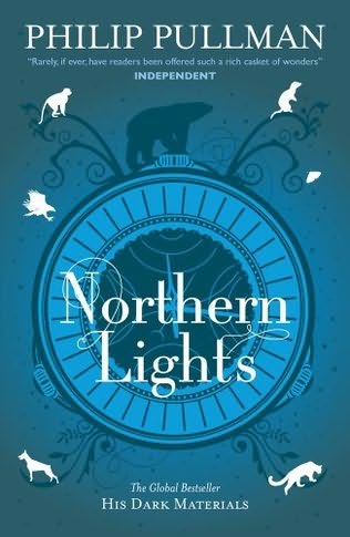
Those new covers, my first impression was "goddamit, those things are pretty", but in a second look, I think it sells the book as something way softer and more delicate and sweeter than it is. It's an art nouveau-ish approach that makes it look like a Jane Austen novel, or something like that. I don't think that's pretty accurate, in my humble opinion.
But I still can't find them ugly at all.