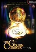
The Golden Compass Poster
Posted on by Will

The ShoWest motion picture industry convention begins today and a teaser poster for The Golden Compass movie has been snapped by IESB.net. The poster features a glowingly-lit alethiometer, with the tagline (word-for-word from the book) of “It is the alethiometer. It tells the truth. As for how to read it, you’ll have to learn by yourself.” The poster also reaffirms the movie’s release date: December 7th, 2007. That’s a little under nine months today. Thanks to Dustin for the tip. View the poster.

This entry was posted in Posters, The Golden Compass movie. Bookmark the permalink.


21 Responses to The Golden Compass Poster

  1. Skye says:

    -pokes you gently-

    You mean December 7th, dear.

  2. Will says:

    *blinks*

    Damn Americans and their backwards dates.. Thanks.

  3. Craig says:

    OMG it’s getting closer! I bet it’s only a matter of time before we get at least a teaser trailer.

    And the poster really looks like the LOTR teaser posters if you think about it. So excited!

  4. Jammer says:

    Will- you mean you Europeans and YOUR backwards dates 🙂

    Anyways, pretty cool poster, still kinda hard to decide how it looks since it has the reflection of other posters in the back blending in with it, but it is exciting news nonetheless.

  5. Shan says:

    I wonder what that triangular-shaped symbol is? It looks like a church or cathedral or something. Perhaps that is going to be a motif in the film? We’ll have to wait and see…

    I pictured the teaser poster to have actual characters on it, eg Lyra, Mrs Coulter, Lord Asriel, Iorek Byrnison, Lee Scoresby and Serafina Pekkala etc. But its turned out to be ok, having the alethiometer, since that’s the name of the film anyway (golden compass).

  6. Kinders says:

    I’m really not fond of that font they keep using; it’s such an overused fantasy font. Just a font or no, it keeps whispering to me, “nothing special; nothing unique”.

    (I guess it’s not actually nine months from now if the date was a mistake – ?)

  7. Nadiene says:

    I can’t see it!!! The link won’t work! 🙁

  8. Corsair of Umbar says:

    This isn’t the final poster. It’s for Sho West. Trust me.

  9. Lizzietiffon01 says:

    groovy

  10. Silverfist says:

    Well, looks pretty nice to me. I might rather a poster with some characters on it too, but i do ike the alethiometer.

  11. Annabel says:

    Wow… *eats teh poster with excitement*

    If you go by logic, the european date system is right.

    DD/MM/YYYY

    Smallest (day) then second smallest (month), then the longest period of time (year) makes so much more sense.

    I don’t know why it’s different, actually O__o

  12. hoobits/Ben says:

    Definitely a teaser for ShoWest with a lot of LOTR-ness in it. But I like that they actually lift the line from the book for the tagline. I also like the multiple rings/windows reflecting in the center of it, suggesting multiple universes.

  13. Kel says:

    Is it just me, or did they throw the Magic Kingdom castle onto the alethiometer?

  14. jessia says:

    i feel like the teaser material for the NYC toy fair a year or two ago was of much better/impressive quality. but maybe the toy fair is a bigger player than this showest convention.

  15. mysterygal says:

    OMG!OMG!OMG!
    AAAAAHHHHHHHHHHHHHHHHHHHHHH!!!!!!!!!!!
    THE MOVIES GETTING CLOSER AND CLOSER!
    and the home page looks great!
    ohhhhhh!i CANT wait!

  16. silvertongue says:

    omg !! omg omg omg !! OMG !!! i wish we read the american date as a european .. CANT WAIT !!!

    & Kel with your comment :

    “Is it just me, or did they throw the Magic Kingdom castle onto the alethiometer?”

    well i think it might repersent the Chariot or the Clouded Mountain .. but who knows ????

  17. Kain says:

    I can see the poster of Hot Fuzz in the background.

  18. Kain says:

    I can see the poster of Hot Fuzz behind the aleithometer.

  19. hoobits/Ben says:

    Kain: You see the Hot Fuzz poster because the is isn’t actually a “poster” but a slightly translucant banner. Although I assume you now that.
    Jessia: ShoWest is a convention for theatre owenrs to come and see what studio films are in the works. I would consider it to be bigger than toyfair because these are the people who will ultimatly decide how large the North American release will be.
    The Iorek/Lyra banner definitely had more of an “ooomph” to it.

  20. jessia says:

    hmm, the high res poster looks a lot more professional but it still seems very simple. the NYC toy fair poster was more impressive, but it wasn’t very indicative of the project, but neither is this one.

  21. Fausto Vicente says:

    C’mon. Look at that. THE GOLDEN TOILET! LMAO!